Dulce
InDesign | Illustrator
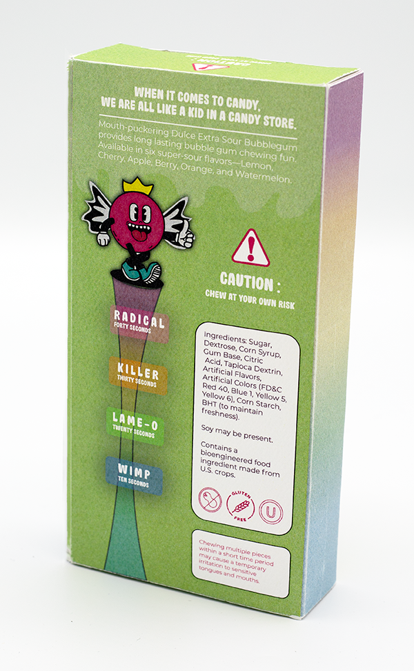
Dulce is a rebranding and packaging redesign project that elevates a low-cost, generic candy into a premium, giftable retail experience. The goal was to reposition the product at a higher price point through thoughtful branding, illustration, and structural packaging design.
The Challenge:
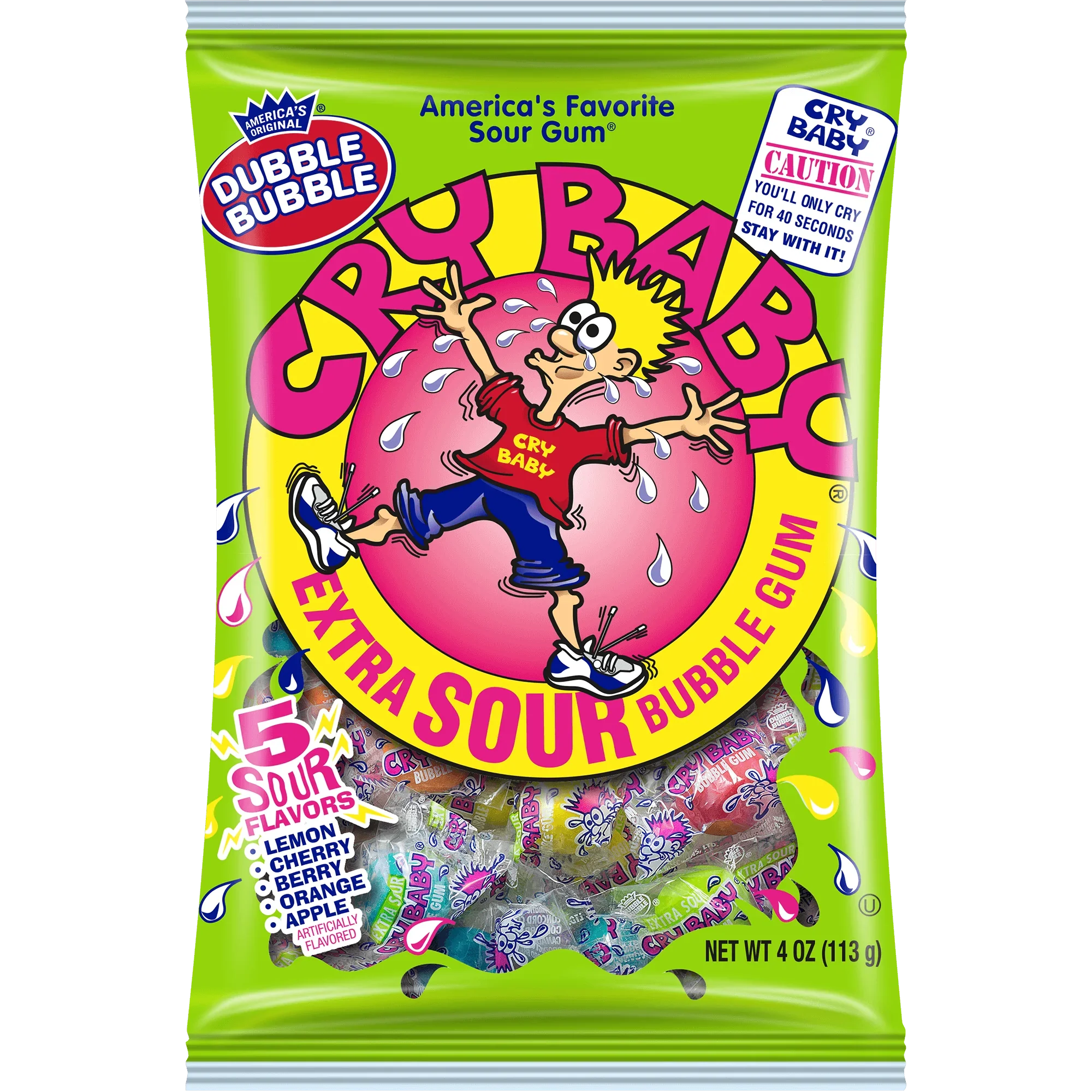
I selected a dollar-store candy product and redesigned it to feel premium and shelf-competitive. Extra sour bubble gum stood out for its strong nostalgia and emotional connection. The original product, Cry Baby Extra Sour Bubble Gum, relied on loud graphics and novelty appeal but lacked a cohesive brand story or an elevated design system.
The Solution:
Dulce frames sour gum as a playful challenge: a social experience rooted in childhood competition, humor, and shared memories. The brand blends bold color, expressive illustration, and retro-inspired visuals to feel nostalgic yet fresh.
Dulce is designed to appeal primarily to kids, with packaging that feels interactive, character-driven, and fun, while also resonating with adults seeking nostalgia. The result is a brand that feels timeless rather than disposable.
The visual language balances youthful energy with intentional design, allowing the product to feel elevated without losing its sense of fun.
Visual Identity
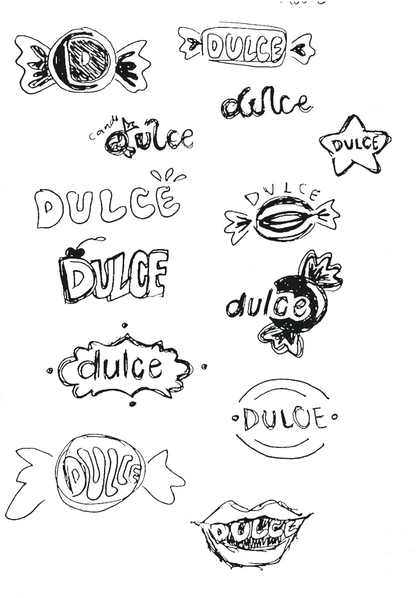
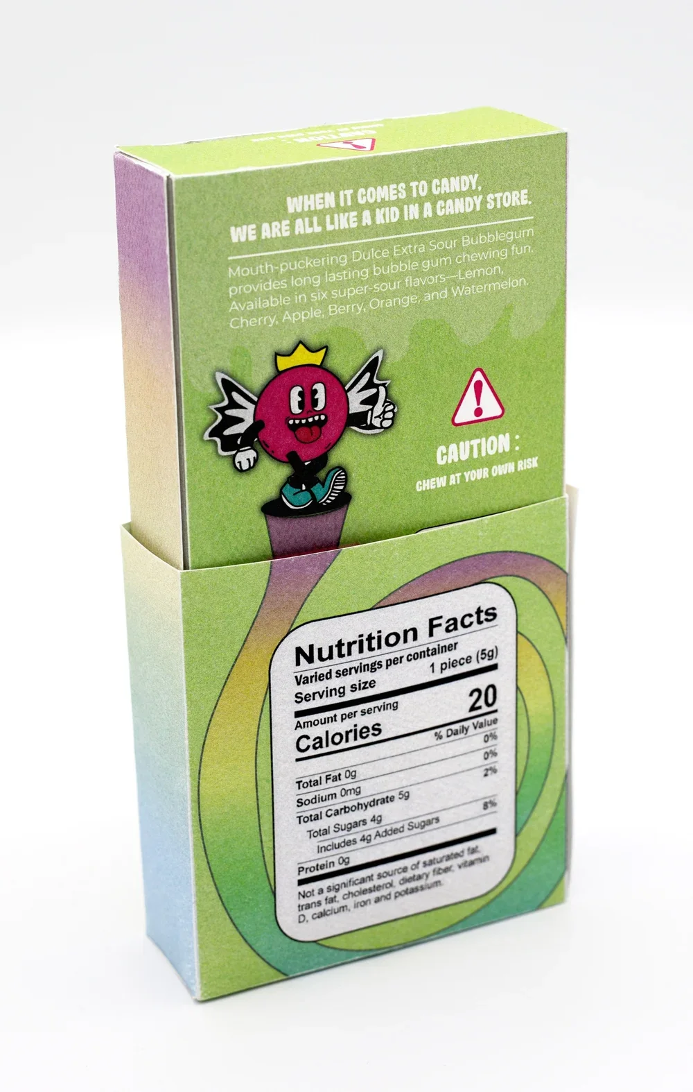
The identity centers around a custom logotype and expressive character illustrations that create emotional connection and memorability. Bright color palettes and dynamic compositions help the product stand out on shelf while reinforcing the brand’s playful tone.
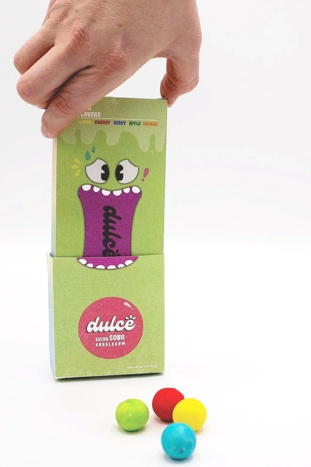
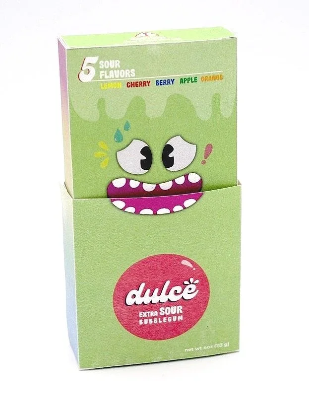
I designed and fabricated the full packaging system, including structural design and printed components. The box format elevates the product beyond a bagged candy experience, positioning it as shareable, giftable, and collectible.
